Tips for Configuring Grids in 2Ring Dashboards & Wallboards
2Ring Dashboards & Wallboards Blog Cisco Dashboards DW UCCE UCCX Wallboards
This blog post would like to help users who are new to configuring layouts in 2Ring Dashboards & Wallboards, a real-time reporting solution for Cisco Unified Contact Centers – Express (UCCX), Enterprise (UCCE), and Packaged UCCE.
Problem Definition: You mastered the configuration basics and you created a grid with all the real-time statistics that you need. You placed the grid in a layout only to find out that you have too many columns to fit on your screen, causing some of the text in a grid to get cut off (agent and queue names and/or values).
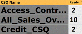
This is an example of what your grid might look like after your initial configuration.
When this happens, our customers and Cisco Partners usually ask us if we plan on allowing users to specify the font size for grids in each column or at least introduce an “auto-fit-text” feature for titles and values based on what the column size is set to.
The answer is that yes, we plan on introducing some of the requested options in the next major release of 2Ring Dashboards & Wallboards since these requests keep coming in. However, it needs to be understood that using the auto-fit option will make each row or cell use a different font size, which will impact the design. Also, setting a font size firm will make it more difficult if not impossible to view the same layout on multiple screens of different sizes and resolutions.
We at 2Ring believe that the current feature set provides many ways to resolve this situation without configuring font sizes and we would recommend that users experiencing the issue described above fine-tune their grids and layouts using these means even once additional font sizing options are provided.
The Solution
The golden rule is simple: “Look at your layout and search for empty spaces. Remove these spaces.” Here are some suggestions on what to do:
1. Abbreviate / Shorten Text in Titles
Do you really need the Service Level column to be called Service Level Percentage? How about SL% or simply SL? Review text in all headers and try to make it shorter (but still understandable).
2. Change Column Heights
You can also try to adjust space reserved for headers. The default column header is set to 15%; go with 10%. This will automatically adjust font size. Font for data will increase while the font size in headers will decrease. If it happens that your data do not fit, consider changing the value’s display format. Do you really need SL% to be displayed as 98.23%? Would 98.2 work as well? Analyze all your data formats and make changes if needed.
3. Adjust Your Layout
Go to the layout hosting your grid, and simply reserve less vertical space for your gird. This will most likely make your content fit, and at the same time it will create room for additional KPIs or another grids below or above it. You can also add a message ticker, current weather ;), a live news stream, PowerPoint slides, and much more. Please remember that the use of some of these content types means that you will need to run your layout in 2Ring DW – DESKTOP Client.
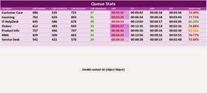
Space for Grid made smaller, to 1) decrease font size, 2) create space for additional content..
4. Increase the Number of Rows
If all you really need is just that one grid, you can increase the number of rows displayed in your grid. This will leave your layout intact, and your data/texts will fit. You can play with the number of rows to maximize the font size used.
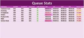
Grid in 2Ring DW with additional, empty, rows to decrease font size.
5. Last Resort Option 😉
If none of the above generate the desired result, then we recommend that you split your grid into two separate grids and A) place both in one layout, or B) if you are using DESKTOP Client and you have no space to place on your screen to fit the second layout, create a sequence of two grids. The sequence means that in one area of a layout, each grid would only be displayed for X seconds, so you can be flipping back and forth between multiple grids.
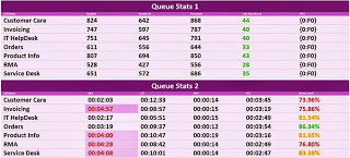
Two Grids in 2Ring DW above each other.
Summary: The capability of layouts built in 2Ring Dashboards & Wallboards to automatically scale / resize to the space provided is a major benefit and therefore we recommend that users follow the steps described above when building layouts to enjoy the same fine-tuned layout on any screen and any device with a supported browser (Chrome, Firefox, IE9+, and Safari) including iPhone, iPad, Lumia, Surface, Galaxy, Chromebook, .. Those few extra minutes that you invest into building your layout will return via better usability for users. Please share your experience with 2Ring Dashboards & Wallboards by leaving a comment below, or even better, by tweeting your screenshots while mentioning our Twitter handle @2RingCX.